Playing with colors...
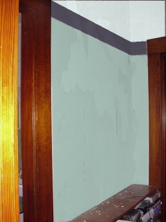
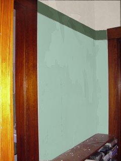
I decided not to tear down any wallpaper today. However, I've been playing with the Benjamin Moore Personal Color Viewer, and trying out colors for my hallway. What do you think? Here are my two favorites (currently, the first one is my favorite.)
I am thinking about doing an stencil in the band between the colors--period, of course, but I couldn't find anything earlier that I could make look decent.
I am, however, in love with this:

It is an illustration from Decorative Flowers, which is a book full of Art Nouveau designs. Not the right period, I know.
I thought about replicating the original wallpaper that I uncovered last night (or close to it, at least) but I don't have a big enough piece to see the entire rest of the pattern (Here's a picture, though.)
 However, I do like the first stencil on the list from this site as well. (The Craftsman Vine.) But it's too big. DE13 from this site is cool. (There doesn't seem to be a way to see individual ones on this website, which is kind of irritating when you're trying to link.) I also like DE22, 24, and 28 from the same site.
Here's a really bad photoshopped border:
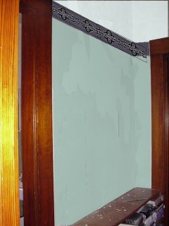 Obviously, it wouldn't be done in black. But I don't think it would look too bad, do you? (It's not like it will be very visible, especially in this spot, since the bookcases would cover it. But it would be fun to try.
I am thinking about doing an stencil in the band between the colors--period, of course, but I couldn't find anything earlier that I could make look decent.


I am, however, in love with this:

It is an illustration from Decorative Flowers, which is a book full of Art Nouveau designs. Not the right period, I know.
I thought about replicating the original wallpaper that I uncovered last night (or close to it, at least) but I don't have a big enough piece to see the entire rest of the pattern (Here's a picture, though.)
 However, I do like the first stencil on the list from this site as well. (The Craftsman Vine.) But it's too big. DE13 from this site is cool. (There doesn't seem to be a way to see individual ones on this website, which is kind of irritating when you're trying to link.) I also like DE22, 24, and 28 from the same site.
Here's a really bad photoshopped border:
 Obviously, it wouldn't be done in black. But I don't think it would look too bad, do you? (It's not like it will be very visible, especially in this spot, since the bookcases would cover it. But it would be fun to try.


1 Comments:
You would probably really like the book, too, since it's full of stuff like that. I picked it up on a clearance rack a long time ago.
Post a Comment
<< Home